Indonesia
 English
 Arabic
 French
 Spanish
 Portuguese
 Deutsch
 Turkish
 Dutch
 Italiano
 Russian
 Romaian
 Portuguese (Brazil)
 Greek
Looking to Buy Wholesale Display Boxes with Fast and Free Delivery in the UK?
Shopping |
2026-10-27 08:44:55
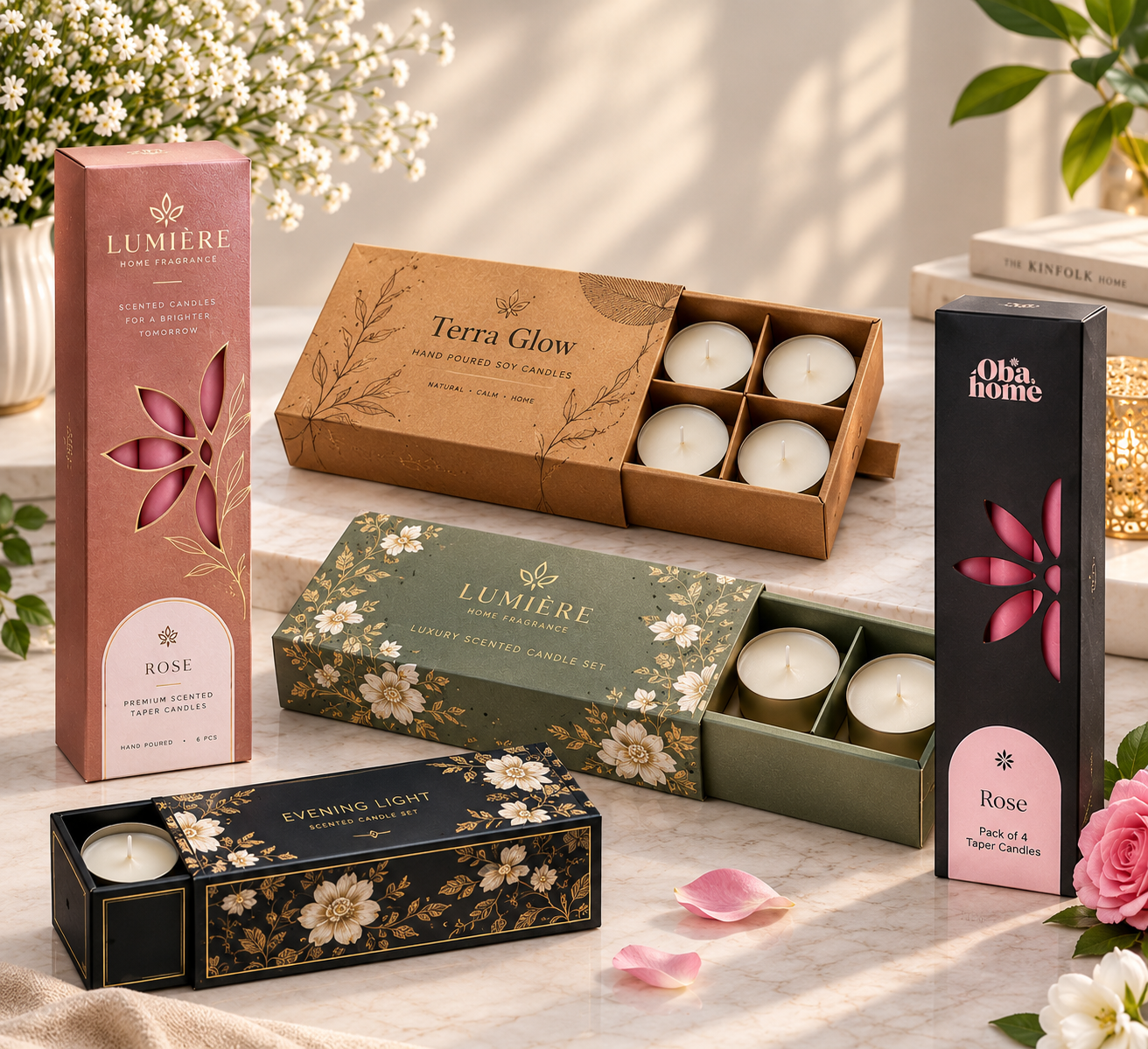
A shopper picks up your candle because the box caught their eye, or walks past it because it did not. In a store full of competing scents, your box has about three seconds to do its job: look good enough to pick up, and say enough to justify the price. Good candle box design is not about expensive decoration. It is about clear choices: the right structure, colors that fit the scent, text people can actually read, and one or two finishes that make the box feel worth its price. This guide walks through those choices for candle boxes, one by one.
1. Start With the Candle, Not the Artwork
Design starts with measurements, not colors. A jar's height, width, lid size, and weight decide the box style, the board thickness, and whether you need an insert. A heavy glass jar in a thin carton will bend the box and disappoint the buyer, no matter how pretty the print is. Measure first, then choose a structure that holds the candle firmly, tuck-end for light candles, auto-lock bottoms for heavy jars, rigid boxes for premium sets. When the structure is right, the artwork has a solid stage to stand on.
2. Match the Box Style to Where It Sells
A candle box for a boutique shelf and a candle box for an online order do different jobs. Retail boxes need shelf presence: a clean front, a visible scent name, and colors that stand out among neighbors. Online boxes need protection first, with a mailer that survives transit and still looks good on arrival. Gift boxes need a third quality, the feeling of unwrapping something special. Pick the style for the channel, and the design choices after that get easier.
3. Colors That Fit the Scent
Color tells the buyer what the candle smells like before they open it. Soft pastels suit floral and fresh scents, deep tones suit woody and amber scents, and bright colors suit fruity and seasonal collections. Stick to two or three colors plus your brand color — more than that looks messy on a small box. And test colors on the actual board: the same shade looks different on white cardstock, brown kraft, and black board. Print a proof before approving a full run.
4. Typography People Can Read
Your scent name and brand name must be readable from a few feet away, because that is how far shoppers stand from the shelf. Use one clear font for the scent name and a simpler one for details, and keep the front panel uncluttered. Burn time, wax type, and safety warnings belong on the side or back panels, where buyers look once they have picked the box up. If the front panel tries to say everything, it ends up saying nothing. As a rule, pair one decorative font for the scent name with one plain font for everything else. Two decorative fonts on one small box fight each other, while one decorative plus one plain keeps the design elegant and easy to scan.
5. Finishes That Add Perceived Value
Finishes are how a mid-priced candle starts to feel premium. Matte lamination gives a soft, modern feel and hides fingerprints. Gloss makes colors brighter and bolder. Foil stamping draws the eye to a logo or scent name, embossing adds texture buyers can feel, and spot UV highlights one detail with shine. You do not need all of them — one or two well-chosen finishes beat five competing ones, and they cost less too. As a guide, matte suits natural and boutique brands, gloss suits bold and colorful collections, and foil suits gifts and limited editions. Match the finish to the feeling you want the buyer to have, not to the number of effects you can afford. When you order custom candle boxes, you can combine matte lamination with foil on the same box for a balanced premium look.
6. Design the Unboxing Moment
The sale does not end when the box is opened — that moment decides whether the buyer comes back. A printed inside lid, a short thank-you note, tissue paper in a matching color, and an insert that presents the candle neatly all make the experience feel considered. For online orders, this matters even more, because the box is the only physical contact the buyer has with your brand. Small touches here create reviews, photos, and repeat orders. Seasonal touches work the same way: a different tissue color for holidays or a limited-edition sleeve can make a regular candle feel special without redesigning the whole box.
7. What to Print on the Box
Beyond branding, every candle box needs practical information: scent name, net weight, burn time, wax type, and safety warnings. Many retailers refuse products that miss this information, so treat it as part of the design, not an afterthought. Place required details where they are easy to find, keep the font size readable, and leave a clean space for a barcode if you sell through retail.
8. Eco-Friendly Design Choices
Buyers increasingly prefer packaging that does not harm the planet. Kraft board, recycled content, paper-based cushioning, and minimal plastic coatings all signal sustainability — and they suit the natural look many candle brands want. Keep it honest: only claim what your materials actually deliver, and check recycled content and coatings before printing eco claims on the box.
9. Design Mistakes to Avoid
Three mistakes show up again and again. First, a crowded front panel with too many fonts, colors, and claims. Second, text so small that scent names blur on the shelf. Third, skipping the proof — colors shift on kraft, dark inks behave differently, and a spelling mistake multiplied across thousands of boxes is painful. One proof, checked carefully, prevents all three.
10. Design for Different Candle Types
One design does not fit every candle shape. Jar candles give you a wide front panel, so put the scent name and brand where they read instantly, and consider a window so buyers see the wax color. Taper candles give you tall, narrow panels — use vertical typography and keep details on the back, because a long panel with small horizontal text is hard to read. Pillar candles have a broad face, so a bold scent name and one strong image work best. Votives and tealights give you very little space, so keep the front to brand plus scent only, and move everything else to the back. Designing around the shape keeps every product in your line looking intentional.
11. Before You Approve: The Design Checklist
Never approve a design straight from the screen. Run through this checklist first: scent names and spelling, colors checked on the actual board, barcode space left clean, text clear of fold lines, and bleed set correctly. Then ask for a proof — digital for speed, or a printed sample for a big run. Check the proof in daylight, not just under office lights, because colors shift. Ten careful minutes here prevent thousands of candle boxes with a mistake you cannot undo.
FAQs
How much does custom candle box design cost?
At BoxPrinting4Less, design support is free. You pay for the boxes and printing, with no die and plate charges, and you can get an instant quote for your exact specifications.
Can I use one box design for all my scents?
Yes. Keep the same structure and brand layout, and change only the scent name and accent colors. This keeps your brand consistent and your costs down.
How long does design and production take?
Standard production is 7 to 8 business days after artwork approval, and rush production is available when you need boxes faster.
Do I need a barcode on my candle box?
Only if you sell through retail stores. If you do, leave a clean, uncluttered space for it in the design so it scans easily.
Can I print inside the box?
Yes. Inside printing works well for a short message, a scent story, or care instructions that buyers see the moment they open the lid. Keep it short — the inside should surprise, not lecture.
What file format should my artwork be in?
Send high-resolution artwork in AI or PDF format with CMYK color settings, which is the format printing presses use. JPG, EPS, and TIFF files also work, but AI or PDF give the cleanest result.
Ready to Design Candle Boxes That Sell?
Get custom candle boxes from BoxPrinting4Less — no minimum order, free design support, and free USA shipping.